Case Study: Jerry’s Artarama Redesign
Project Overview:
Client: Jerry's Artrama (Hypothetical)
Role: UX Designer
Project Duration: 1 week
Team: Eileen Avci
Tools Used: Figma, Photoshop
Project Background:
One of my hobbies is illustration, so I spend a fair amount of time on art sites, trying to find the best deals on art supplies. One of these art sites I came across was the art retail store “Jerry’s Artarama.” When I was going through their website, I found it disorganized and cluttered. I decided to challenge myself to see if I could improve their website.
Goal
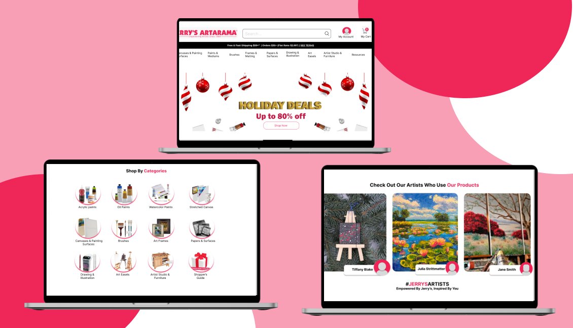
Improve the look and feel of Jerry's Artarama's main screen to make it more motivating for users to use the services provided on the website and easier to navigate.
Solution
I cleaned up the website's main page to have a clear look.
I made sure that there was enough space between the elements.
I ensured that the different sections on the webpage were distinct and their titles were .
I added a section to the search tool that helps you customize your search results. When the user clicks on the search bar, it lists the categories available and the most popular searches.
The Design Process
I wanted to determine what made Jerry's Artarama website overwhelming and confusing. I decided to analyze and compare the main screens of art supplies sites and what made them easier to navigate. I looked at the websites of Blick Art Materials, Arteza, Joe's Art Supplies, Jackson's, and Michaels.
When I compared this to Jerry's Artarama main screen, I found that:
Jerry's Artarama’s main screen has too many sections that need to be visually distinct. It is also longer than any of the other sites I have looked at, making scrolling through it confusing and tiring.
The promotional illustrations for products contain too many words. This makes the different titles compete and leads to visual clutter.
There needs to be more space between elements.
The hierarchy of titles needs to be more consistent. The titles could be more descriptive.
User Research
I reviewed the website's customer reviews to understand Jerry's Artarama users' frustrations better. I found that users find the website is difficult to navigate and that it has a confusing layout, making it hard to find and purchase items.
User Personas
I created three user persons better to understand the goals and motivations of the users
Key Findings
The website interface should be user-friendly and easy to navigate. It should present the most critical information, such as discounts and sales, so users can find it.
Wireframes
Important Disclaimer:
The images, text, and logo of Jerry's Artarama website used in the prototype are taken from the actual site. I do not own them.
The only image I have made is in the carousel part at the top. I have created the image using Photoshop. I have also changed the titles of the different sections that split the main screen into different services.
User Testing
I tested my initial design with 4 users. The feedback I got was that ;
The section titles were vague, so I changed them to make them easier to understand.
The shapes used in the website were inconsistent, so I made all my assets circular to have a more unified look.
The last section where artists displayed their work wasn’t clear, so I added a feature that had the artist’s names under the artwork they made.
Hi-fi Prototype
Here, you can access our high-fidelity Prototype. Scroll to see the whole main website redesign.
What I Learned
During this process, I learned and gained knowledge of website design and layout information. I also gained insight into how different people may view a website differently. I was familiar with different art site websites, but the users I tested with were not used to this type of interface. This helped me view my design from the eyes of brand-new users and made my design less confusing and more accessible to people with different levels of knowledge and experiences.
If I were to expand this project, I would also like to redesign other parts of the website. In the website reviews, users also talked about how the checkout process was long, with repetitive verification processes and pop-ups that disrupted it. I would also like to redesign that feature.


