Case Study: TopoMars
Project Overview:
Client: Nasa (Hypothetical)
Role: UX Designer
Project Duration: 10 weeks
Team: Eileen Avci, Efra Ahsan, Connor Lee, Damien Flutre
Tools Used: Figma, Photoshop
Project Background:
In a 10-week college course at UW Bothell, I worked in a group of four people where we were tasked with creating a communication system between Mars and Earth.
Problem
Taking place in the future, the human race is running out of time on Earth due to global warming and must create a detailed topographic map of Mars to plan for infrastructure on its surface. Scientists have decided that mapping Mars through conventional means, such as sending settlers, would be too expensive and time-consuming.
Our Solution
We decided to create a topographic mapping software interface allowing NASA scientists to map Mars from Earth remotely.
The Design Process
We started by doing preliminary research on Earth-Mars communication and narrowed down our ideas to mapping Mars. We then created our personas and their user goals.
User Personas
We decided to focus on three main user tasks. These tasks were:
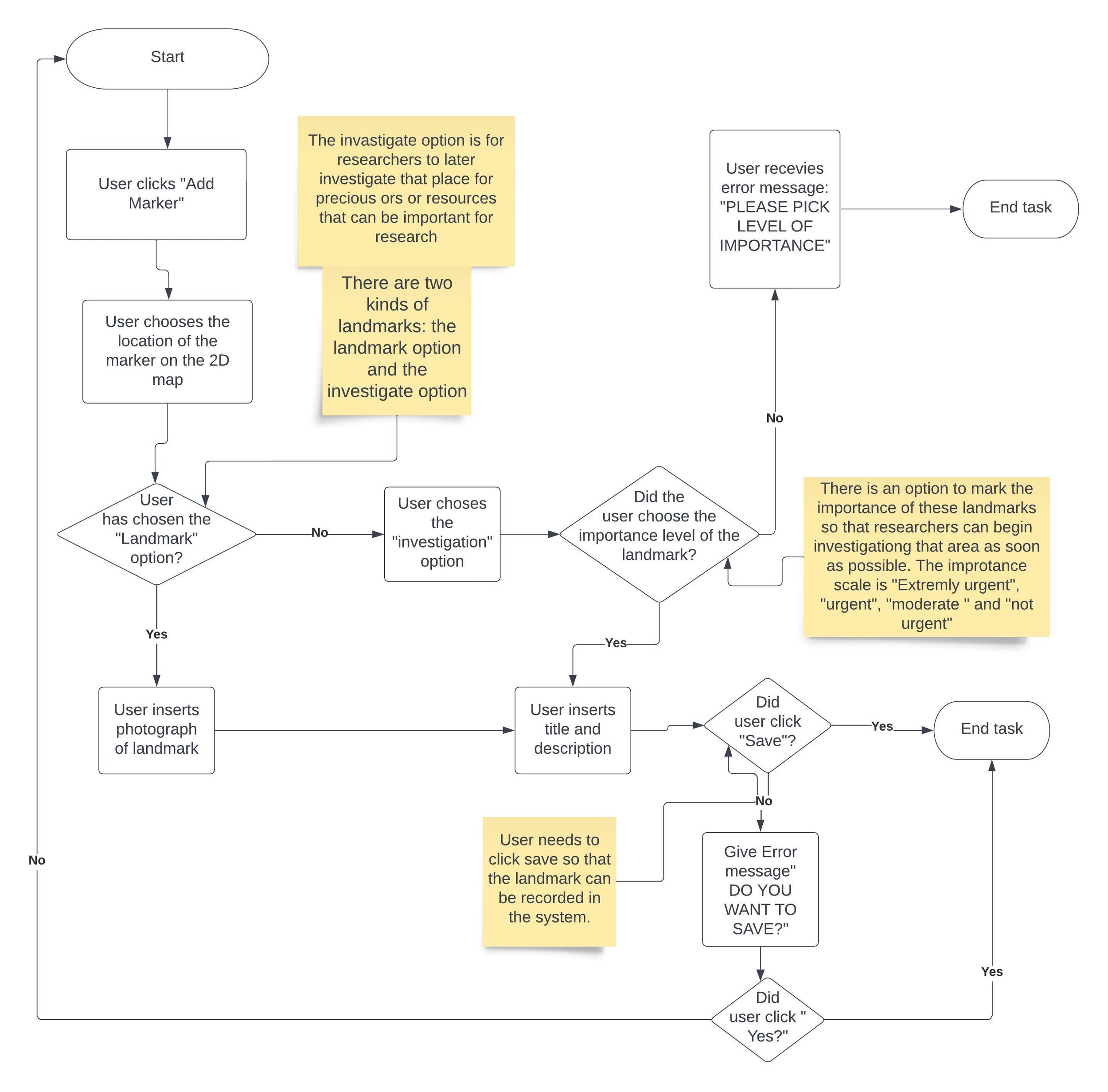
Placing waypoints on the map. By placing waypoints, scientists can name and mark essential landmarks on the map and bring attention to places that NASA needs to investigate further.
Measuring the distance between waypoints.
Assigning photographs to waypoints.
I was the designer of the first task of placing waypoints.
My User Taskflow of Task 1
My Wireframes
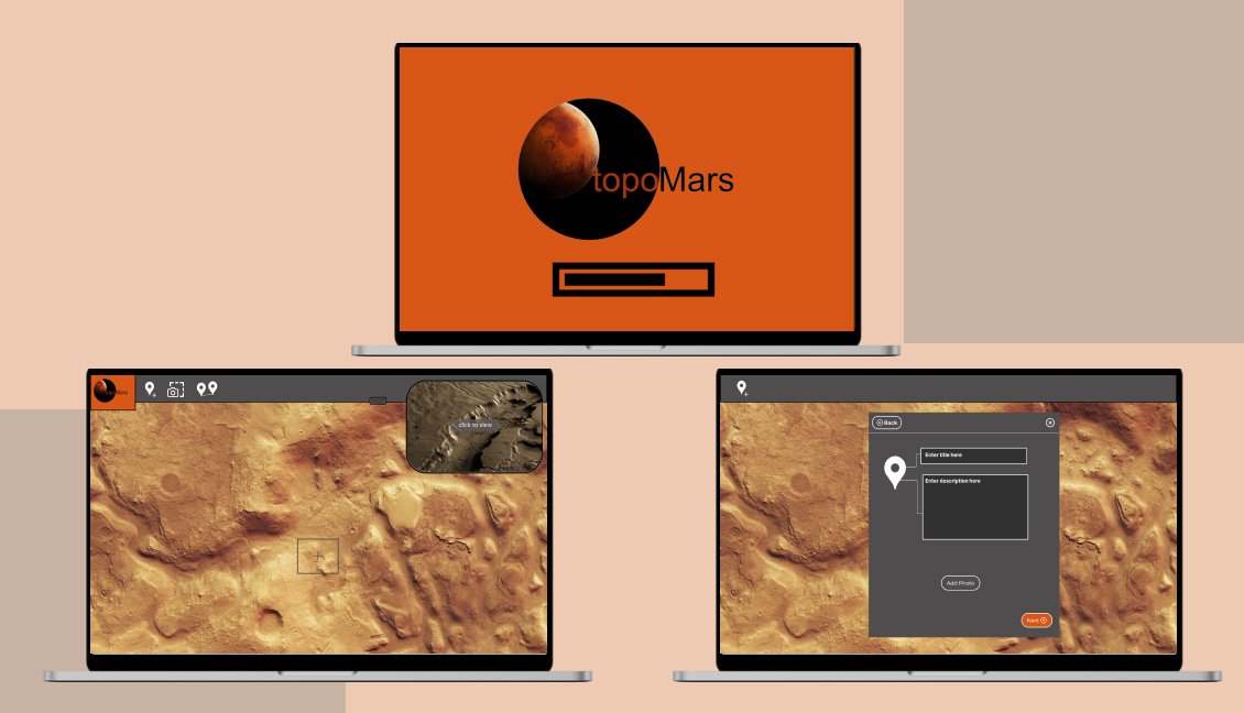
I made the wireframes for the popup screens, 2D map feature and main screen of the app.
MoodBoard and Style Guide
User Testing
We ran three tests with three different users, each consisting of the user tasks. We presented our testers with a prototype version of our app and asked them to preform the three tasks using the prototype. We processed the results in a data collection sheet, where we actively wrote down notes during the usability tests and later verbally discussed our results as a team.
Results of the User Testing
The "Level of Importance" feature was often skipped, as users didn’t understand its function until after completing other sections.
Users appreciated the overall layout and found the task flow to be fluid.
Users where able to complete the other two tasks fluidly and without problem.
High Fidelity Prototype
After receiving feedback from users, we fixed the issues found and made the final high fidelity prototype using Figma.
Click here to access the final prototype.
What I Learned
This process taught me the steps taken in the Stanford D school design thinking process and the importance of narrowing our ideas using the design funnel. I also gained more experience in the design process, learning more about sketching, wireframing, and prototyping.
What I found most valuable about pursuing this project was that it taught me the design process and learned a lot about how to communicate and work as a team effectively. I will use the experience I gained here for my future projects.


